The hero image is easy. The third slide is the job.
I have spent my career on one thing: holding a visual identity to the same standard everywhere — in a printed brochure, on a conference booth, in a board-level presentation, and on the third slide of a sales deck. This page is built for one role: Brand Designer, Brand & Design at ICEYE.
ICEYE builds systems that have to hold under pressure. So does its brand.
A demanding European and North American events calendar, a lot of print, and a small team whose job is to make design self-service for everyone else. That is the job I have been doing at WithSecure: similar scale, a similar security posture, and the same requirement that quality repeat itself without me standing over every asset. Six pieces of evidence below — one for each thing you said you would weigh.
Six cases — one for each of your must-haves.
Type as a system, not decoration
Typography is the first thing I fix and the last thing I let go. Across the WithSecure identity I set the type scale, the grid, and the rules for how headline, deck and body behave — from a two-page leave-behind to a six-metre wall graphic — then wrote them down so other people could hit the same standard without me.
Layout is the same work with a different tool: rhythm, hierarchy, and what you leave out. Most of what I do in a day is this — not big ideas, but correct spacing.
Role: type scale, grid system, editorial layout
Collaboration: brand, comms and product teams plus external studios
One type system at three scales: leave-behind, presentation, large format.
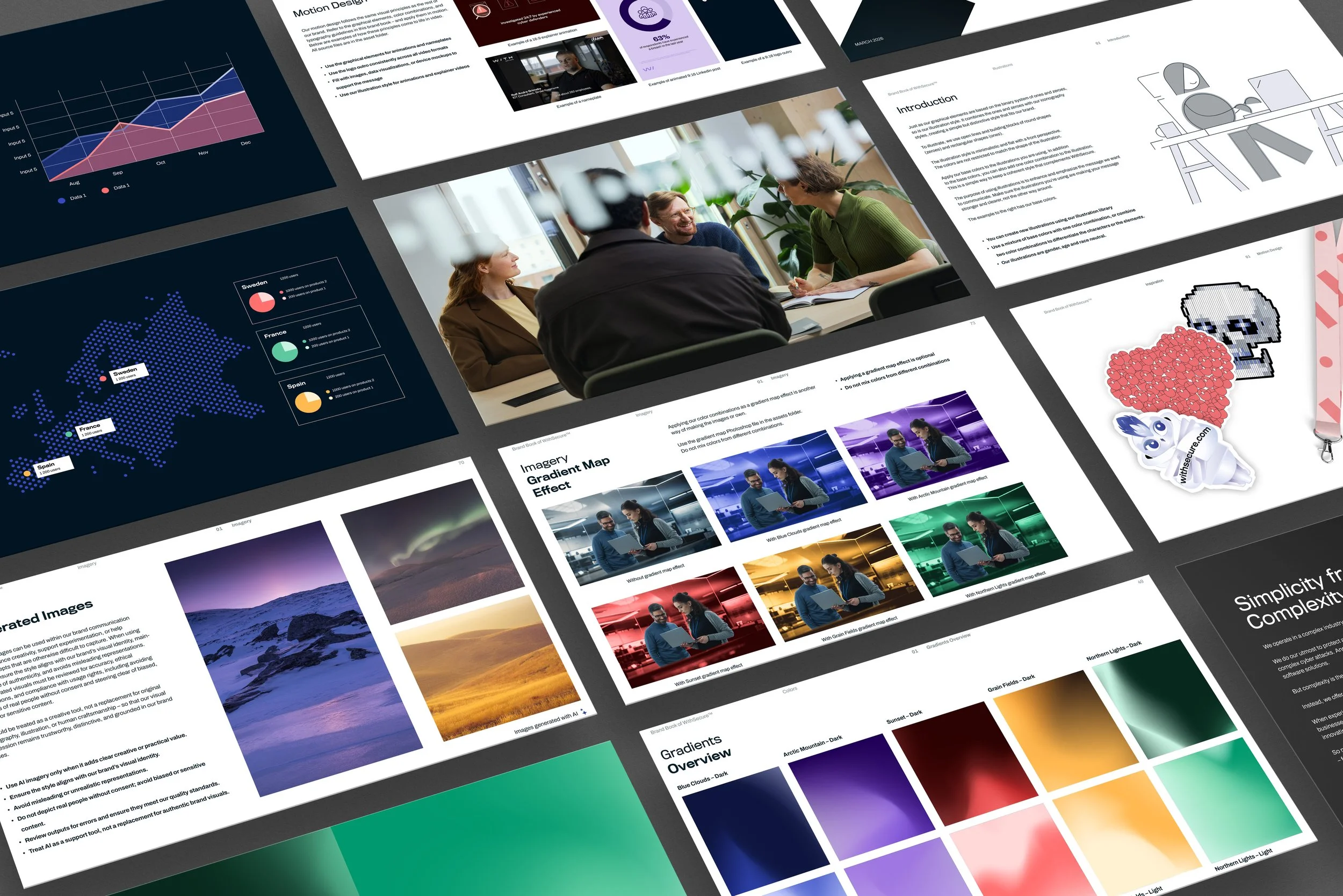
182 templates, one typography, one chart style — plus the decks that cannot be templated.
182 templates people actually use
Decks are where brand consistency usually dies. I rebuilt WithSecure’s presentation layer end to end: 96 PowerPoint templates and 86 Canva templates, built so that a salesperson in Munich and an analyst in Singapore land on the same typography, the same grid and the same chart style without asking design for help.
And I still design the ones that cannot be templated myself: executive and board-level material, on a deadline, complex content compressed into something clear and credible.
Role: concept, build, ownership
Users: sales, marketing, product and leadership across five markets
Through the press, not just to the PDF
I take print all the way myself: bleed, colour management and profiles, stock selection and finishing — and the conversation with the printer where the proof gets checked before the press runs. I can brief a printer, read a proof, and say what is wrong with it.
[FILL IN: one concrete example — which piece, what size, what stock and finishing, which printer. One precise example convinces more than a list.]
Role: layout, print-ready artwork, proofing, production supervision
See the print workPrinted material as it arrives from the press.
Museum of Malware Art — from brief to opening night. Grand One Silver 2025 and Vuoden Huiput Silver 2024.
Museum of Malware Art — and the booths, trucks and rooms around it
I led the visual concept and execution of a public exhibition from brief to opening, working with an advertising agency: wayfinding, wall graphics, large-format print, print production, and making a whole room read as one thing. Awarded Grand One Silver in 2025 and Vuoden Huiput Silver in 2024.
The same work repeats at smaller scale all year: WithSecure CyberTruck (wrap and large format on a moving surface), Sphere by WithSecure (our own conference identity, stages, signage, giveaways) and trade-show stands built with partners.
Role: visual direction and execution, briefing production partners
Brand book 2.0 → 3.0, and the guardrails that made it self-service
I build and own the company-wide design system: the single visual reference for internal teams and agency partners across the Nordics, DACH, Benelux, APAC and the US. I took the brand book from 2.0 to 3.0 — broader, more consistent, and translated into working rules rather than a gallery of nice examples.
The goal was never that everyone asks me. It was that nobody has to: illustration language, motion rules, gradients and data visualisation under one system, documented so it holds without me in the room.
Role: concept, build and ownership
Partners: external agencies and studios across five markets
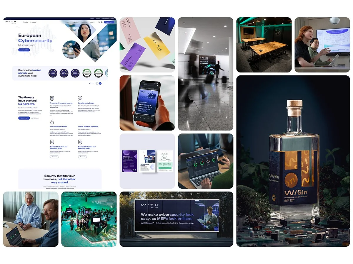
One system across digital, physical and campaign surfaces.
A colleague says what they need → an agentic layer constrained by the brand identity and design system generates the artwork → they finish it in Canva across 86 templates, or edit the generated file directly.
AI in production — and in templates that scale beyond the design team
I led the adoption of AI-assisted tools inside design and content production, and wrote the company’s first guidance for AI image generation — quality, responsibility and brand fit first. The interesting part is not speed but constraint: an agentic layer bound to the design system produces material that does not need fixing afterwards.
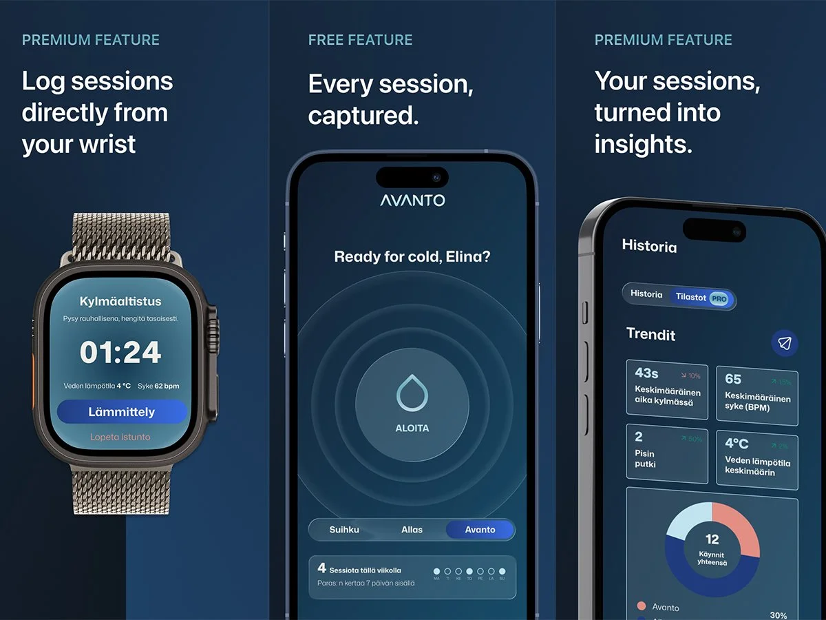
I took the same approach into my own work: I designed and built an iOS and watchOS app, AVANTO, solo. It is in beta now.
Role: leading adoption, writing the guidance, own product build
Briefing agencies, studios and colleagues
I do not work alone. How well I brief and steer shows up best in how partners and colleagues describe working with me — three of them here.
Tommi is one of those rare creatives who immediately raises the level of everything he touches. His talent for design and branding is exceptional, but what sets him apart is his ability to turn great ideas into work that actually makes an impact. He’s a fantastic colleague to work with and someone I trust completely on any brand or creative challenge.
I’ve always been impressed by Tommi’s exceptional design instinct, creative talent, and ability to lead agencies to deliver outstanding work. He’s a rare combination of hands-on creative excellence and inspiring leadership.
Tommi is unusually good at both the in-house craft and steering partners. He has a point of view: he recognises a good idea fast and carries it through so the result stays sharp from start to finish.
Figma native, Adobe at professional grade.
Daily
When the work calls for it
Motion, 3D and data visualisation — nice to have, in your words.
I can do these and I am glad to use them. They are just not what my portfolio is made of — which is why they are down here rather than at the top of the page.
Motion & video
After Effects and Premiere Pro for social cutdowns, event loops and product sequences. The motion rules in the brand book are mine too.
Data visualisation
The data visualisation rules are part of the design system I built: chart types, colour logic, and keeping complex data readable on a slide and in print. SAR and GIS data would be new to me — the principles would not.
Three principles that keep quality standing under volume.
Systems before one-offs
A good identity is not made once, it repeats. I build the rules and the tools that make quality replicate across teams and channels.
Craft at the boring end
The third slide, the back page of the leave-behind, the bottom edge of a sign. They decide whether a brand is believed more often than the hero image does.
The goal is self-service
I have succeeded when other people no longer need me for the routine — and my time goes to the work that actually needs a designer.